
Generating Responsive Image Widths from a Master: Best Practices for Web
How to export responsive widths (640w, 768w, 1024w, 1280w, 1920w) from a single high-resolution master without repeated re-encoding generation artifacts.
How to export responsive widths (640w, 768w, 1024w, 1280w, 1920w) from a single high-resolution master without repeated re-encoding generation artifacts.
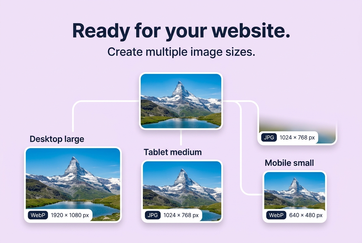
Generating Responsive Image Widths from a Master: Best Practices for Web
Direct Answer: To serve fast-loading images that pass Google's Core Web Vitals (Largest Contentful Paint), a single 4000px image should never be delivered to every device. Instead, web developers generate a set of responsive widths (e.g. 640px for phones, 1024px for tablets, 1920px for desktops) in both modern WebP and universal JPEG, served via HTML <picture> and srcset attributes.
Why Generating Directly from the Master Matters
A common mistake in automated image pipelines is cascading downscaling: taking a compressed 1920px image, saving it, downscaling that to 1024px, saving again, and so on. This introduces cascading quantization artifacts (lossy re-compression degradation).
Browser Image Converter's Website Export Pack always branches directly from your uncompressed original master image, rendering each distinct resolution cleanly from native memory.
Recommended Width Breakpoints
- 640w: Mobile phones and small viewports.
- 768w: Tablets in portrait orientation.
- 1024w: Tablets in landscape and smaller laptops.
- 1280w: Standard desktop monitors.
- 1920w: High-definition full-width hero banners.
How to Generate Your Complete Pack
- Open Website Export Pack.
- Select your master photography or banner file.
- Check the desired width breakpoints.
- Provide clean accessibility alt text.
- Click Generate export pack to download a ZIP containing all image files,
manifest.json, andresponsive-snippet.html.
Last updated: July 2026
This guide is reviewed by the BIC Editorial Team to keep the recommendations accurate, private, and practical for browser-based image workflows.
About the Author
Abhay Tabbay is a web developer and image optimization specialist focused on privacy-first browser tools that help people convert, resize, and optimize images without uploading files to the cloud.
Related Articles
Try the Tool
Need this workflow right now? Open our free in-browser image tools and process files locally.
Open Browser Image Converter Tools