
How to Integrate Responsive Srcset and Picture Elements into Your Website
A developer guide on implementing modern HTML picture elements, responsive srcset attributes, sizes calculations, and lazy loading for web performance.
A developer guide on implementing modern HTML picture elements, responsive srcset attributes, sizes calculations, and lazy loading for web performance.
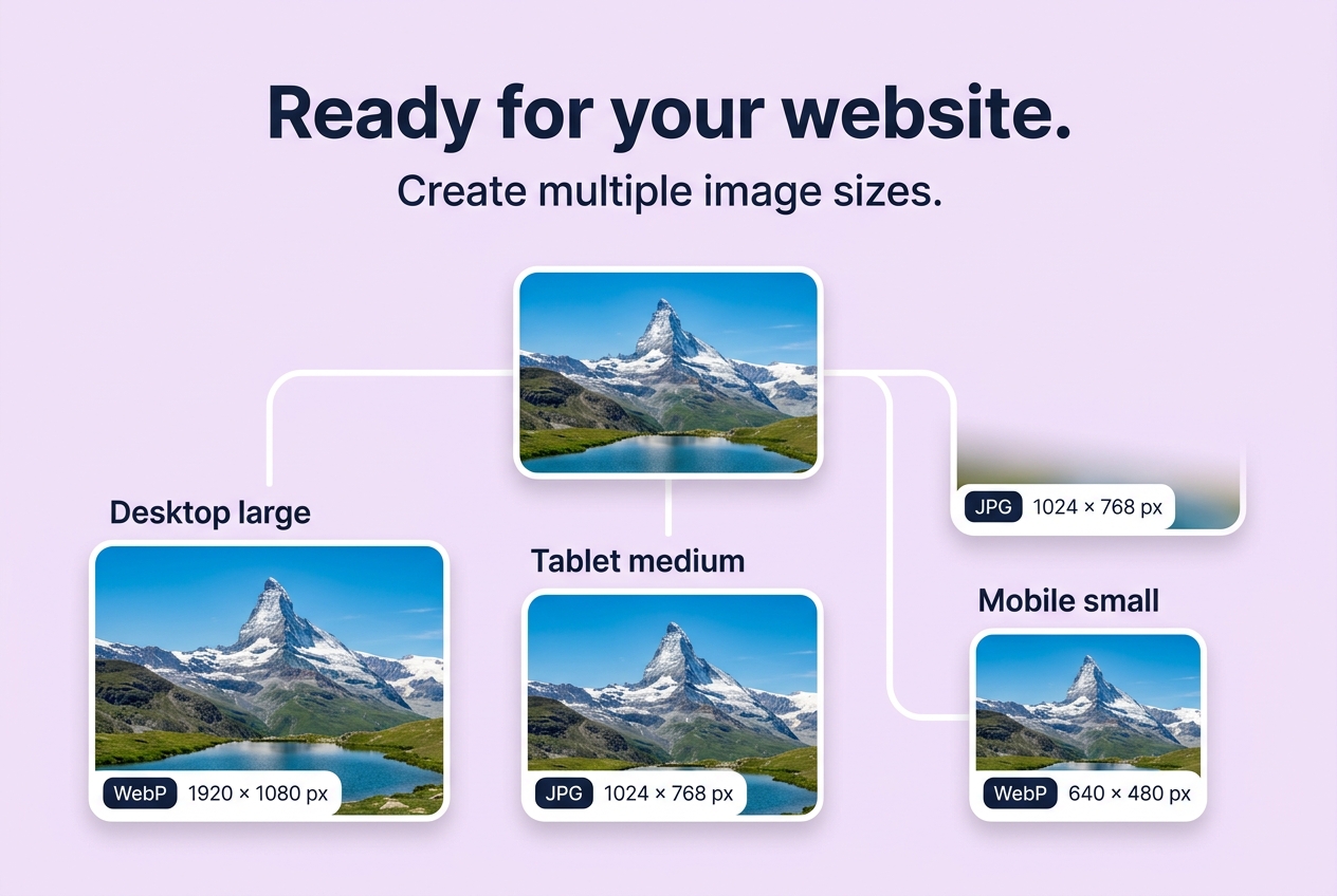
How to Integrate Responsive Srcset and Picture Elements into Your Website
Direct Answer: To serve the optimal image file to every user according to their screen width, network speed, and browser capabilities, use the standard HTML5 <picture> element combined with <source type="image/webp" srcset="..."> and a fallback <img> tag with loading="lazy".
Anatomy of a Perfect Responsive HTML Image Snippet
When you export a package from Website Export Pack, you receive a ready-to-use responsive-snippet.html file formatted as follows:
<picture>
  <!-- 1. Modern WebP for browsers supporting next-gen formats -->
  <source
    type="image/webp"
    srcset="
      hero-image-640w.webp 640w,
      hero-image-1024w.webp 1024w,
      hero-image-1920w.webp 1920w
    "
    sizes="(max-width: 640px) 100vw, (max-width: 1024px) 80vw, 1200px"
  />

  <!-- 2. Universal JPEG fallback for legacy environments -->
  <img
    src="hero-image-1024w.jpg"
    srcset="
      hero-image-640w.jpg 640w,
      hero-image-1024w.jpg 1024w,
      hero-image-1920w.jpg 1920w
    "
    sizes="(max-width: 640px) 100vw, (max-width: 1024px) 80vw, 1200px"
    alt="Descriptive accessibility text written by author"
    loading="lazy"
    decoding="async"
    width="1920"
    height="1080"
  />
</picture>
3 Key Integration Steps
- Copy the generated image files (
.webpand.jpg) from the downloaded ZIP archive into your website's/images/or/assets/directory.
- Paste the
responsive-snippet.htmlmarkup into your template or CMS component.
- Update the relative file paths (e.g.
/assets/images/hero-image-640w.webp) if your assets are hosted in a subfolder or CDN.
Last updated: July 2026
This guide is reviewed by the BIC Editorial Team to keep the recommendations accurate, private, and practical for browser-based image workflows.
About the Author
Abhay Tabbay is a web developer and image optimization specialist focused on privacy-first browser tools that help people convert, resize, and optimize images without uploading files to the cloud.
Related Articles
Try the Tool
Need this workflow right now? Open our free in-browser image tools and process files locally.
Open Browser Image Converter Tools