
Avoiding Blurry Upscaled Assets: Native Resolution vs Browser Scaling
Why upscaling small images to fit high-DPI screens produces blurry, soft graphics, and how to preserve crisp rendering without unnecessary file bloat.
Why upscaling small images to fit high-DPI screens produces blurry, soft graphics, and how to preserve crisp rendering without unnecessary file bloat.
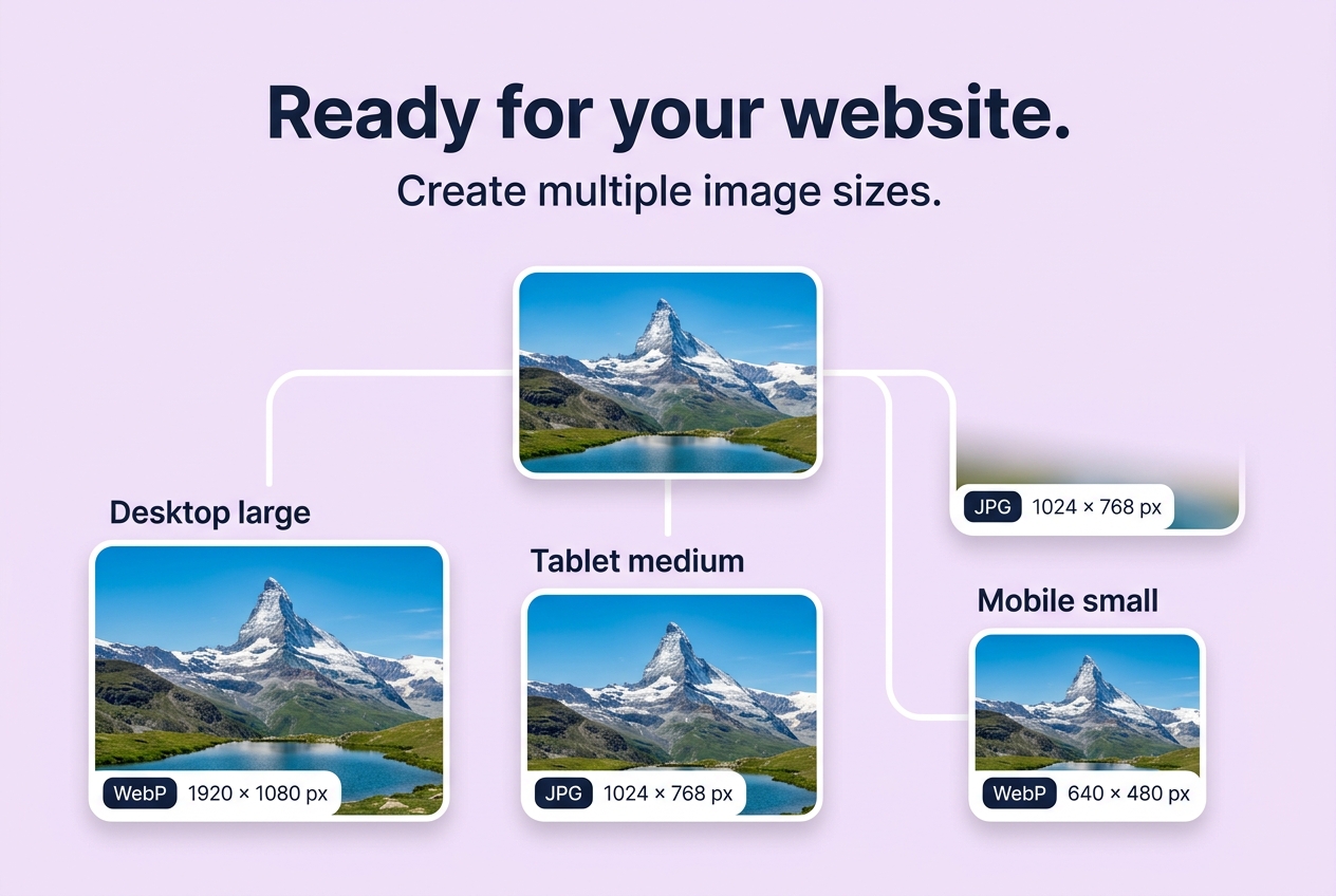
Avoiding Blurry Upscaled Assets: Native Resolution vs Browser Scaling
Direct Answer: Modern smartphone screens and laptop monitors use high-DPI displays (such as Apple Retina screens with $2\times$ or $3\times$ device pixel ratios). If you display an image scaled larger than its native pixel resolution, the browser must interpolate intermediate pixels using bilinear filtering, causing noticeable blurriness, soft edges, and muddy text.
The Core Rule: Downscale Only, Never Upscale by Default
In web asset production:
- Never Invent Pixels Blindly: If your master image is only 1200 pixels wide, generating a 1920w asset from it merely inflates file byte size without adding any real optical detail.
- Cap Generation at Master Bounds: Our Website Export Pack automatically skips generating breakpoints that exceed your source image width.
- Target 1.5× to 2× Density: For a card displayed at 300px on mobile, supply a 600px width asset via
srcsetso Retina screens render razor-sharp details.
Last updated: July 2026
This guide is reviewed by the BIC Editorial Team to keep the recommendations accurate, private, and practical for browser-based image workflows.
About the Author
Abhay Tabbay is a web developer and image optimization specialist focused on privacy-first browser tools that help people convert, resize, and optimize images without uploading files to the cloud.
Related Articles
Try the Tool
Need this workflow right now? Open our free in-browser image tools and process files locally.
Open Browser Image Converter Tools